Often you'll see cohort analysis as a report offered by ecommerce platforms like Shopify. They can be pretty-looking reports but quickly overwhelm even the most data-minded marketer.
I'd like to help you get past that and learn to use and love your cohort analysis.
What is a cohort analysis?
A cohort analysis is an analysis of people's behavior over-time but where the people are separated into groups.
This separation into groups is key to the analysis. How they are separated will determine what behavior they have in common and what behavior differs from everyone else.
Cohort analyses are used in a variety of industries but I'm going to focus on how to perform cohort analysis for ecommerce stores. Specifically Shopify stores and on their customer behavior. This particular type is often called a customer cohort analysis.
Once you get an idea of how it works there, you can apply the concepts to other groups (e.g. email subscribers, retail shoppers, etc) and in other settings.
Why a cohort analysis important for ecommerce
Ecommerce and Shopify stores are driven by their customer behavior. Even simple behavior like "did this customer buy or not" can have dramatic impacts on the business as a whole.
The majority of marketing in ecommerce is to either directly drive customer purchases or influence future customer purchases. So understanding that behavior and any cause/effect from it can be a very valuable process.
In cohort analysis specifically you're comparing all of the different groups of customers and measuring which groups where the best (and worst). Then you can try to adjust what you did to mimic the best group and avoid the worst group.
Done right a cohort analysis can help marketing understand what works for your customers, brand, and products.
Let's get past the generalities and go into specifics now.
Cohort analysis example
Before I talk about how to build a cohort analysis, I want to start by showing a finished one. Knowing what it looks like in the end should help make it easier to understand.
(And there's plenty of cohort analysis software out there to create it for you, including my own)
This cohort analysis is created by my app for Shopify stores using customer and order data. This specific example is demo data I create for the app that lets stores try it out before they install. You're welcome to use the demo to follow along if you want. Just know that the demo data is refreshed regularly so what you see in the live demo will not be exactly the same as the examples below.
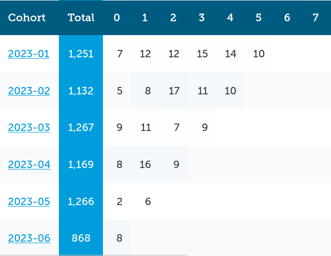
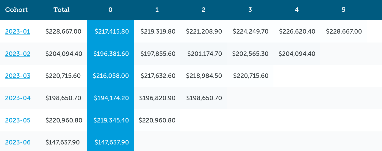
We'll start by looking at the first cohort report that measures how many customers bought (the behavior metric).
How to read a cohort analysis
Let's define how the cohort report is laid out. You'll need this in order to read the cohort analysis, otherwise it just looks like a clump of numbers.
The first row labels the columns. The first column lists the groups of the customers (the cohorts).
1. Figure out how the cohort report is grouping
Figuring out how a cohort analysis is grouping is the vital first step to understanding. A report that groups by a customer's first order date will be vastly different than one that groups by their birth date or country of birth.
Remember, the groups determine how you are comparing the behavior from one cohort (group) of people to another. Changing which behavior, changes the grouping.
In this example (and for the vast majority of ecommerce-based cohort reports), the cohort groups are time-based and are for specific months. These are the months of the customer's very first order, a key point of behavior for ecommerce.
So the second row is the cohort "2023-01", the third is cohort "2023-02", and so on.
To be clear, because this trips up a lot of new people, that doesn't mean the second row shows orders placed in 2023-01. Rather it shows behavior for customers who belong to the cohort named 2023-01. It actually shows orders placed over five different months.
The date-based names make it easier to understand, you could have called them something random and the actual analysis wouldn't change. It just might be hard to remember that "Crazy Ape" was customers who bought in January, "Shy Fish" was February, and "Boaty McBoatFace" was March. Choose easy to remember cohort names.
2. Read across to understand one groups behavior
Now that you know how the grouping is done, we can start to figure out what the cohort analysis is showing.
Let's look back at the Customers example and look at the very first cohort, "2023-01".
This cohort has a Total of 1,251 and then a 0 of 7, 1 of 12, 2 of 12... and further number gobbledygook.
This is the first problem with cohort reports. They are data-dense and show a lot of data at once so it can be difficult to figure it out.
(If you're using the demo app, I've added extra content and hints when you're interacting with the data. Those don't work with a static screenshot though of if you're building your own cohort analysis).
Total in this case means the total number of customers in the cohort. Since the cohort is a group of customers based on when they first ordered, this report is telling us that 1,251 customers first ordered in 2023-01.
Each of the columns after that (0, 1, 2, etc) are the number of months after their first order. That means the values 7, 12, and 12 are telling us how many of this cohort's customers ordered 0, 1, and 2 months later.
0 months later is a funky one but it means there are customers who placed their first and second orders in the first month. Note: these could be great customers so there's a specific analysis we'll cover just for them later.
Why use 0, 1, 2 months and not just the month name like January, February, or March? Because when you look at a different cohort, the months are different. Month 2 for 2023-01 is March but Month 2 for 2023-05 is July.
This "standardizing" of the number of months is what makes a cohort analysis a useful alternative view of your customer behavior. Normally you just see reports that are date-based: orders by month, revenue by year (Those are called time-series analyses by the way). Cohorts twist those reports and make the customer behavior the most important measurement.
We'll come back to interpreting a cohort analysis in a minute. I want to show a few other ways to read the report first.
3. Read down to understand a cohort's age
The next way to read the report is by reading down a column.
You've already seen how to read down to see the different cohort names.
You can do the same for the Total and month columns. This can give you a very easy apples-to-apples comparison of how the different cohorts behaved at the same point in their lifecycle. Column 3 will show how customers behaved 3 months after their initial order, column 6 would show the 6 month behavior.
(This is great for figuring out anniversary promotions by the way)
4. Read diagonal to understand calendar-based behavior
Finally, there's a third way of reading a cohort analysis: on the diagonal.
By reading values on the diagonal you can compare how different cohorts all responded in a specific calendar month.
Remember that each cohort is grouped by month so the cohort row right below would be a newer cohort by one month. 2023-01's month 3 (April) is 2023-02's month 2 and 2023-03's month 1. Looking at those three cells gives you a view into how those three cohorts behaved in April.
Compare their performance and you can see how powerful diagonal cohort reading can be.
Cohort analysis metrics
Let's take a quick side trip to metrics.
With cohort analyses you can calculate near any metric. You have your groups of cohorts for the row and the months for the columns, so any behavior done by a customer at a specific time can be measured and put into a cohort.
We've been using the cohort report for the number of customers reordering so far because a customer reordering is a big behavior to optimize for.
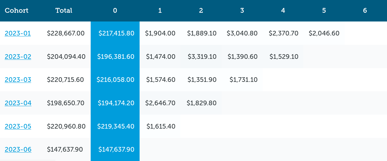
But perhaps you're more interested in total revenue. Maybe you don't care how many customers you have, only how much they spent (e.g. a volume play vs premium play). In that case, calculating the total revenue earned in each month for each cohort makes a lot of sense.
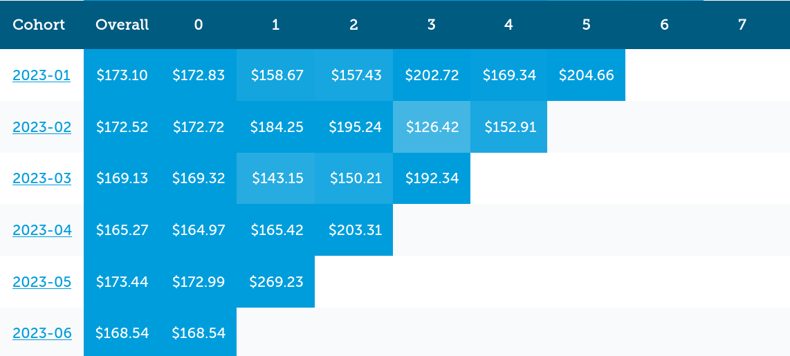
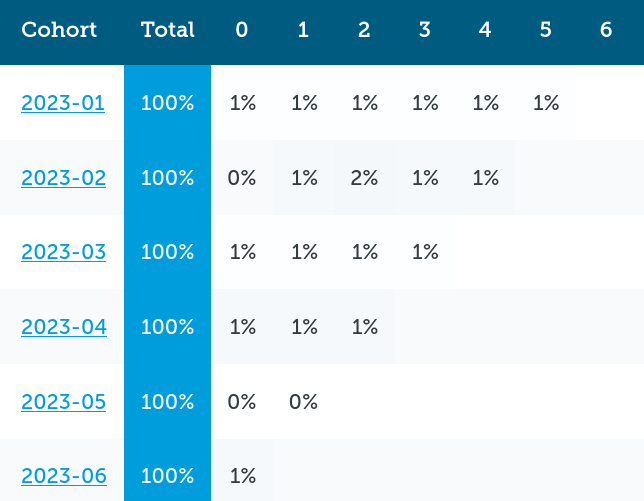
Or perhaps you're looking to optimize your Average Order Value (AOV). Then you'll calculate the AOV for customers and orders in each cell and get something like this:
Some metrics won't work too well in a cohort analysis. Customer lifetime value (CLTV, LTV) is one. It can be done but really what you're measuring is the Average Customer Lifetime Value and even then, you're not measuring the lifetime part. You're measuring what the total value was at different points in time (Month 0, Month 1, etc).
This kind of running metric is less useful that many stores hope. It's still good, just not great and might not be worth the time to calculate.
How to use cohort analysis
Now that you have an idea of how to read a cohort analysis, it's time to figure out how to use them.
The whole point of these is to better understand how different groups of customers behave differently. The majority of the analysis will be comparing one group to another.
We'll reuse the three examples from above and walk through different ways of interpreting the cohort analyses. Here's direct links to each if you want to open them for reference:
Analysis: changes in new customers coming in
Finding out when you have a significant change in the number of new customers can be a major eye-opener for the long-term health of your store. When you get more new customers, you're likely to have better performing months in the future as some turn into repeat customers. Inversely, not attracting new customers can hurt your performance.
This is a simple analysis to run using the customer count metric:
- Scan down the Total column
- Look for really high and low numbers
One caveat with this: the current month can be lower than the others depending on what day of the month it is. If it's the 10th of the month and that cohort is only showing 1/3rd of the new customers, you're actually right on track.
Looking at the sample customers cohort, the cohorts all look quite close. February and April were a bit lower than the others but not much to worry about. Especially considering those two months have less days than the others.
The current month is June so normally you'd ignore it being low, but this screenshot was taken on June 28th. That means there's only two days left in June to "make-up" by 300 customers, which is 3x the average customer growth.
This analysis tells us that June is way behind on attracting new customers and should be looked into.
A useful process when analyzing is to keep an issue list. This is just a simple list of good and bad things that you want to dig into. Let's add June's performance to that list
Issue list:
- 2023-06 is behind on attracting new customers
Analysis: revenue changes from new customers
Similarly, an analysis be done on the cohort's total revenue to see how new customers are spending.
Using the Total Revenue example, it's pretty much the same as the customer counts. February and April are lower but not by much. June is really low.
Even though we got the same conclusions from both reports, that might not always be the case. New customers who place very small orders or very large orders can make one of these appear to change while leaving the other the same.
Looking at the cohort AOV can factor that out easily but let's update the issue list again before going on.
Issue list:
- 2023-06 is behind on attracting new customers and has a lower than expected total revenue.
Analysis: AOV changes from new customers
Just like before, AOV can be compared. This time scan down the Overall column now to see how AOV has changed.
Looking at how the Average Order Value changes from cohort to cohort, you can see it's really consistent overall. February is actually a pretty good month and March isn't so hot now.
Even looking at the initial month (Month 0) for each cohort, they are all pretty consistent.
So far the main conclusion we've drawn is that June just hasn't had the new customer volume as in the past. The new customers are buying like normal, there just aren't a whole lot of them around.
Issue list:
- 2023-06 is behind on attracting new customers and has a lower than expected total revenue.
Analysis: Month 0 second orders
Now let's take a quick look at another cohort analysis, second orders in the initial month.
From what I've seen, not every cohort tool includes this data. I added it to Repeat Customer Insights awhile back and it highlights a very strong customer behavior that often gets missed.
Going to the customer counts metric, you'll notice there is both a Total (cohort size) and (Month) 0 count.
Be the definition of cohort analysis, every customer ordered in Month 0. If they didn't, they wouldn't have an initial order, and thus wouldn't be a member of that cohort.
Some customers come back for more.
Those are customers you really want to analyze.
That's what the Month 0 measurement is showing. Who came back and placed a second (or third or more) order in the initial month.
In our example for the 2023-01 cohort, that means 7 customers out of the initial 1,251 bought at least twice in January. Identify these customers as they could become super fans or VIPs or whatever you call your best customers.
Let's make a note of that in our issue list.
Issue list:
- 2023-06 is behind on attracting new customers and has a lower than expected total revenue.
- Identify the customers who placed a second order in their initial month. Maybe tag them or send them a special campaign?
Analysis: Month-based
Now for the main analysis people think about when looking at a cohort analysis. Comparing performance by the month.
With this analysis you'd look down a specific month column. You're comparing how each cohort's behavior was X months after their initial purchase.
For example, using customer counts and looking at Month 2 you can see that the 2023-02 cohort outperformed everyone else (17 customers ordered vs 7-12 customers). You'd also see the 2023-03 cohort performed poorly in that month, not even half of the 2023-02 cohort.
Depending on the month, some cohorts will have no data yet or be accumulating data still. This mean any cohort with an empty value (not 0) and the bottom-most cohort with values should be ignored. In this case, 2023-05 and 2023-06 don't have any data yet for the 2nd month (it's in the future) and 2023-04's 2nd month is still accumulating orders.
The month-based analysis can work on any metric and turn up new things. For example, in the Total Revenue example notice how for that same Month 2, 2023-02 has almost double the revenue and now 2023-03 has the least.
Then in the Average Order Value version, 2023-02 has a higher AOV while 2023-03 has a low one.
Putting this all together tells an interesting story in the 2nd month after purchase. Let's add them to the list:
- 2023-06 is behind on attracting new customers and has a lower than expected total revenue.
- Identify the customers who placed a second order in their initial month. Maybe tag them or send them a special campaign?
- New 2023-02 had a large number of their members reorder, producing the highest revenue, and their AOV of those orders was higher than usual.
- New 2023-03 had very few customers reorder which caused the lowest total revenue
That's just looking at three cohorts and one month. There's still three other months and five cohorts to look at.
You can learn a lot from a cohort analysis, even a small one like this.
(That's why in my app I offer cohort analyses for an unlimited number of months. With such a large number of data analyzed for you, you can pick out a lot of issues to look at).
Analysis: Compare how a calendar month performed
Remember earlier how I wrote about reading on the diagonal to understand customer behavior?
Now's the time to do that analysis.
By reading on the diagonal (from top right to bottom left), you can look at the performance in the same calendar month.
Let's look at how the customer counts performed in May 2023.
- May would be 2023-01's Month 4 column (January plus four months)
- 2023-02's Month 3
- 2023-03's Month 2
- 2023-04's Month 1
- 2023-05's Month 0 and initial month (Total)
Let's throw-out 2023-05 as the initial month will be much higher and we want to see repeat customer behavior here.
Reading across the diagonal we see this many customers reorder in May
- 2023-01's Month 4: 14
- 2023-02's Month 3: 11
- 2023-03's Month 2: 7
- 2023-04's Month 1: 16
2023-03's poor performance shows up again with about half the number of customers as the others. 2023-04 performed a little better than average, while the other two were about average.
This is another confirmation that cohort 2023-03 had something going on in May. Notice how many different analyses keep pointing to a specific problem area? That's common and a great way to tell there is an actual problem and not just a statistical error.
The same analysis can be done with revenue:
- 2023-01's Month 4: $2,370
- 2023-02's Month 3: $1,390
- 2023-03's Month 2: $1,351
- 2023-04's Month 1: $2,646
And AOV:
- 2023-01's Month 4: $169
- 2023-02's Month 3: $126
- 2023-03's Month 2: $150
- 2023-04's Month 1: $165
In these views, 2023-04 looks great and both 2023-02 and 2023-03 are looking quite weak. Those should all be added to the list to investigate.
Issues list:
- 2023-06 is behind on attracting new customers and has a lower than expected total revenue.
- Identify the customers who placed a second order in their initial month. Maybe tag them or send them a special campaign?
- 2023-02 had a large number of their members reorder, producing the highest revenue, and their AOV of those orders was higher than usual.
- 2023-03 had very few customers reorder which caused the lowest total revenue
- In May 2023: 2023-03 had a poor month compared to other cohorts with less reorders and less revenue
Analysis: Compare behavior of single cohort, month-to-month
Next, let's take a look at how a single cohort performs from month-to-month.
This is best to save for last. Since you don't have any other cohorts to directly compare it to, you have to trust your gut from the previous analyses and use your issues list to guide you.
Let's pick on the poor 2023-03 cohort to see if we learn anything new.
For this analysis, you're going to read the cohort's row and compare it to itself.
Looking at customer counts, the numbers seem a little lower than typical but nothing really of interest.
Total revenue shows a sizable dip in Month 2 that recovers the next month.
Then AOV shows two dips in Month 1 and Month 2, followed by a higher one in Month 3.
Putting this together it seems like 2023-03's problems come from:
- lower number of customers buying overall
- drops in AOV in Month 1 and 2
- All of which leads to a lower Total Revenue
(I'm not proposing solutions in this article but this smells like an under-performing early customer experience that was released around March or April that caught a lot of this cohort early on)
Reviewing your issues list
Typically you'd finish your analysis by looking at the rest of the data but we'll jump ahead. Now you'd review your issues list and start to investigate the data and what happened over the past few months.
- 2023-06 is behind on attracting new customers and has a lower than expected total revenue.
- Identify the customers who placed a second order in their initial month. Maybe tag them or send them a special campaign?
- 2023-02 had a large number of their members reorder, producing the highest revenue, and their AOV of those orders was higher than usual.
- 2023-03 had very few customers reorder which caused the lowest total revenue
- In May 2023: 2023-03 had a poor month compared to other cohorts with less reorders and less revenue
- 2023-03's Month 2 (May) was a drop in total revenue but recovered the next month
- 2023-03's Month 1 (April) and 2 (May) had lower AOVs than typical, before getting back to normal.
While investigating, I'd recommend making a lot of notes if you find events. Stuff like promotions, new campaigns, advertising blasts, redesigns, etc are all fair-game to note down. If you can connect these events to poor/great cohort performance, you now know how to adjust customer behavior.
Our issues list is irrelevant because the demo data is random but we can pretend that it wasn't just to get some practice. Looking at this I'd guess these events happened:
- We had some failed new customer promotions that went out this month.
- The customers we acquired in February were really good repeat customers, ordering large orders and frequently. Find what campaigns or promotions were running then and use them again.
- The customers acquired in March are weak so those acquisition campaigns under performed, or if they were February's (which worked great) maybe they became stale or something was changed that hurt their performance.
- It took three months to get March's customers back to normal behavior. Check the new customer welcome campaign around that time to see if there's anything that can be moved sooner.
The entire purpose of the issues list is to drive new decisions and changes. The more you can get from the analysis to the issues list to investigation, the more options you have for improvement.
Perform your own analysis
Now that you've seen a few standard ways to analyze cohorts, you can probably start to think of others.
You shouldn't be afraid of your cohort data. If you take the time to go through them, you can uncover a lot of issues.
It takes time but it's high-ROI time.
There are some additional cohort analysis options that I include in Repeat Customer Insights that can help uncover even more issues. I skipped them above to keep them on point but I wanted to share what they looked like so you can get an idea of the different ways they can look at your data.
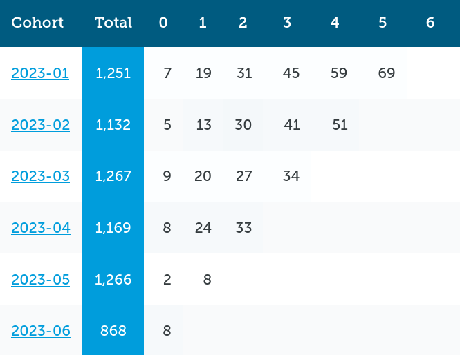
Instead of resetting the data each month for a cohort, it can accumulate into a running tally. This can show you have strong/weak the cohort's behavior is over time.
You can also switch from the raw values to percentages. This smooths over any wild spikes or drops, e.g. holiday season, and lets you compare cohorts of different sizes.
How to build a cohort analysis
Building a cohort analysis is straight-forward but will take a lot of time.
Honestly, it's best to use a software tool like mine which does the cohort analysis for Shopify. You'll save a lot of time, money, and avoid a lot of data errors.
But if you want to DIY it, here's how.
- Figure out your grouping scheme. The first order month+year is probably the best option to start with.
- Figure out which customers are members of each cohort. Remember, a customer can only belong to one cohort in each cohort analysis.
- Decide which metrics you want to measure. The ones outlined here are good but you can start with just one or two:
- Count of customers
- Total Revenue
- AOV
- Calculate the initial month for each cohort and each metric. This might have different calculations than the rest e.g. the second orders in initial month.
- Calculate each of the months for each cohort and each metric
- Calculate the total or average for each cohort
Like I said, it's straight-forward but steps 4-6 are a lot of work. Even if your Excel-fu is strong you're likely going to be pulling down and converting a lot of data for the calculations.
Then each month you'll need to refresh the data, adding a new cohort, calculating the last month's data, and adjusting any refunds/returns that happened.
Cohort analysis software
Given how much time it consumes, that's why using software is oftentimes the better option. Especially for Shopify stores where it's easy for an app to pull all of the data it needs automatically.
For example, in Repeat Customer Insights it takes under a minute for the backend systems to analyze a cohort's initial data and then it's updated automatically on a regular schedule. This makes it near-instantaneous to look at cohorts, even with years of data.
The big problem I've seen with cohort analysis software is that much of it become AI-ified and these are blackboxes. That's where a company won't share how they calculate the metrics, group cohorts, or anything else. You're just supposed to "trust them".
It's my opinion that if a company can't explain how they get the results for your analysis, you shouldn't trust them. Even a vague answer that explains how the math works is better than an AI-buzzword salad.
Cohort analysis vs segmentation
Another issue I hear about is when people compare a cohort analysis vs segmentation.
They seem similar and are very similar on the surface. A cohort analysis for Shopify is basically using customer data to segment customers into the groups.
The main difference is that customer segmentation typically segments based on the behaviors a customer performs in their lifetime with your store, while cohort analysis segments based on one initial behavior that happens when they start their lifecycle, their initial purchase.
Granted, some customer segmentation is based on acquisition metrics like which marketing channel or UTM campaign they last saw. I'd argue that those are actually additional cohort analyses that use a different grouping value. In fact, by analyzing customer acquisition as cohorts can work wonders. But that's a digression for another time.
Back to regular customer segmentation. Since customer segmentation works on behaviors the customer performs over time, it's normal and expected for their segments to change over time. New customer -> Potential big spender -> Big spender -> Loyal -> Lapsing -> Defected is a segment journey a customer might go through over their lifecycle.
With cohorts, your customers don't change. They're in a cohort and that's the one they stay in for their lifetime.
In the end, both cohort analysis and customer segmentation are powerful tools for getting different views of your customer base. Especially if you use an automatic segmentation system like RFM.
There's no reason not to use one in favor of the other. You'd turn to one instead of another depending on what you're trying to look for.
A cohort analysis is just a group analysis
If you want to take only one thing away from this, it should be that a cohort analysis is just a fancy group analysis. How you group and what you measure makes it useful for your Shopify store.
Remember, if you'd like to see a live cohort analysis you can use the demo of my app. There's no registration required and the data is updated automatically. It's not real data but it's a good way to see what cohorts can turn up and to practice your own interpretation of the analysis.
And if you're a Shopify store you can signup for Repeat Customer Insights and get a cohort analysis performed on your own data.
Eric Davis
Which marketing tactics are attracting the best buyers?
By analyzing your customers, orders, and products, Repeat Customer Insights can help find which marketing tactics attract the best customers.