One question I've gotten about Sticky has been,
Why is it shown on both the desktop and mobile?
That's a good question, especially because there are some apps and premium themes that show a sticky add to cart button on mobile only.
The reason is simple:
a good user experience should benefit all shoppers.
For mobile shoppers it makes sense. Scrolling is difficult, especially when your add to cart button isn't right at the top.
For desktop shoppers, it's easier to scroll but would you want to have them scroll all the way back up this page to find the button again?
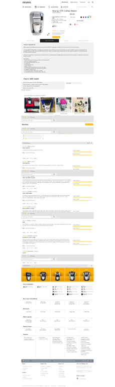
Probably not.
Even though that's a good product page, you're going to lose people as they reach the bottom.
If they had Sticky, there would be a handy Add to Cart button right there for them to click at any time.
What do you product pages look like? Are they making it easy to add to the cart? Reply and let me know.
Or install Sticky and have that fixed within minutes.
Eric Davis