RFM being a three-component model makes it difficult to picture how it works.
If you can visualize a 3D cube in your head, that's how RFM represents your entire customer base. But each individual customer would be a 3D point inside that cube, making it hard to visualize.
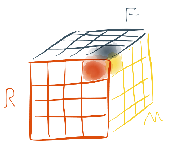
Instead of looking at all three components at once, you can choose look at only two components. Then your customers all show up on flat sheet (a plane, a 2D shape). In Repeat Customer Insights, this is called the Customer Grid.
When laid-out properly, Customer Grids can make RFM more intuitive to use. In the app, the higher scores are to the top-right and represent the best customers. The worst scores are in the bottom left, making them the worst customers.
(One caveat, the Frequency-Monetary grid behaves a bit differently but I'll describe that at another time).
The middle areas are the "it depends" areas. That's where the app's description and advice come in handy.
RFM as a model is pretty powerful. It's kinda difficult to run the analysis without software like Repeat Customer Insights and it takes a bit of work to get how the scores interact. Once you're past that though, it's easy to remember and work with.
Compare how your sales perform
Comparing sales channel performance is vital to understanding where to invest your resources. Repeat Customer Insights will analyze the channels that send you customers so you can directly compare.
Eric Davis